Tuesday 1 March 2016

Visual Language - Form, flow, force

I really enjoyed this Study task, being a fine artist it was great to draw motion in this way.

My drawings of someone flowing through a space;


My sketches seemed very abstract compared to many who drew the actions in stick forms, very mechanical. I feel mine have a lot of vigor, you can feel the motion jumping off the page at you. Even if you can't see clearly the motion that is being undertaken, In my opinion I have captured the motion of the human form very well, my drawings are definitely humanoid in nature.

Here are my squash and stretch drawings;


I found it very difficult to fill the whole of the A2 paper on this task, considering the limited seconds we have to sketch, but still I feel I have captured the squash and stretch movement well especially in my last drawing with the walking squash and stretch movement, I feel I have captured the leg, body and head movements very well to demonstrate the stretching and squashing.


For the next set of drawings we had 10 minutes to sketch, 10 minutes demonstrating a push/pull motion, for this we had longer to labour over and therefore create more detailled drawings.


For this I used a mixture of blue and black ink applied with a square brush to give an angular effect. I like how I have captured her proportions and I love the pose in general with her hair hanging down, it looks very sinister like she is pushing herself up off the table and is about to reveal her face.. Whic you expect to be scary.


My pen marks in this pose add energy to the pulling motion, like I have drawn mid movement when in reality the movement was paused.


You can feel the tension in the legs in this pose that I have captured, reinforcing the force of pushing the table.


Up Montage - Analysis


This part of up really caught me. It is the most emotional part of the film in my opinion, it's not just the content of the scene that makes it so emotional it's how the scene  pans out , the scene feels continuous with the use of effective transitions. This continuous effect gives the illusion that their lives are going to last forever as the scene seems to continue forever, however we are soon shown that this is not the case. In this instance the continuous effect therefore enhances the emotional effect because it settles us in a state of comfort that their lives our happy , which further exposes the tragedy.

 I also love the contrast between the happy and unhappy scenes. The most powerful one of these is the one where they are decorating the bedroom for their child when suddenly the scene pans to the left and we are shown a medical room where we are made aware that she has lost the baby. From then on there is a different tone to the montage, more sad. A darker colour tone to intensify this. Until they start working towards paradise falls, paradise falls becomes the baby in their life. This dark tone comes back round again when she becomes ill and carries through till the end to show how his life ever since has not been the same, he has lost a profound part of his life and is depressed.

I have been inspired by this continuous feel achieved by the transitions and would love to play with this in my animation. It will also give the effect of this long, continuous chain of events that are happening as a result of this war that seems to be continuing and continuing with no signs of stopping.

Maya - Keep on trucking

I found this exercise very difficult and encountered a lot of problems... But towards the end it was safe to say, I REALLY ended up enjoying it. Solving problems and so forth. But I still feel I haven't fully got my head around using it..


Creating and manipulating the primitives was easy enough, the guide I followed was very easy to follow.


It was great to be guided on how to duplicate, stressing how naming your components is a vital feature to stop confusion, with grouping adding extra organisation of components, but you are still able to access the components whilst grouped.


What I encountered problems with was smoothing out the truck edges. The "offset" tool never worked for me. I asked other students for help but still no amendment to the issue was found. The numbers increased but no evidence on my model happened.


My finished truck!

This exercise has really helped me get my head around the axis, moving the components on this axis and using the side view etc, to ensure accuracy with your model. Also how to use the interface, what buttons access what and how to move around the workspace. However I still encounter issues with the edge tool and manipulating with that, also snapping and adjusting the pivot.

Finished renders;


Then I decided to take it that one step further.  I wanted to texture it and add a trailer.

So, for my texturing, used automatic mapping;


After freezing the state of my polygons. I then stiched together all the edges to create a UV map, which I screenshotted and took into photoshop.

Where I added my own elements;


I went for a realistic truck texture, and was very happy with the results.


Obviously there are lots of elements that could do with some improvement, but this has been a MASSIVE learning curve for me, and I have really enjoyed the whole process. I want to do more, and im so glad I took time to watch tutorials.


Applied - Character Designing

I decided to develop my refugee idea.

The refugee crisis is something happening NOW. it is a major crisis and it is reaching its 5th year anniversary of the war starting. (March 15th 2011) therefore I would love to produce an animation campaign to bring it to peoples attentions that this crisis is entering its 5th year.

I also feel the refugee crisis has't got the correct expose by news and media. The media refer to these people escaping war as "Migrants".. The "Migrant Crisis" I hear more often than "Refugee Crisis". Migrants has connotations of people wanting to move country for a better life, rather than escaping in order to save their own lives. This is sending across the wrong connotations of refugees. So what do we use? Migrant or refugee??

 "at UNHCR we say 'refugees and migrants' when referring to movements of people by sea or in other circumstances where we think both groups may be present  boat movements in Southeast Asia are another example. We say 'refugees' when we mean people fleeing war or persecution across an international border. And we say 'migrants' when we mean people moving for reasons not included in the legal definition of a refugee. We hope that others will give thought to doing the same. Choices about words do matter." (Source)


I created a rough thumbnailed storyboard to examine how it would possibly pan out and what potential characters I will design.


I then began character designing.

The characters in this campaign idea will be Syrian nationals, to get an idea how to capture the essence of their ethnicity and identity I familiarised myself with photographs of the refugees in the age groups my characters are. Some were distressing to see. But at the end of the day it is something that we shouldn't ignore because we don't want to see it, what they endure should be highlighted it shouldn't be a taboo. These are real people and real lives.

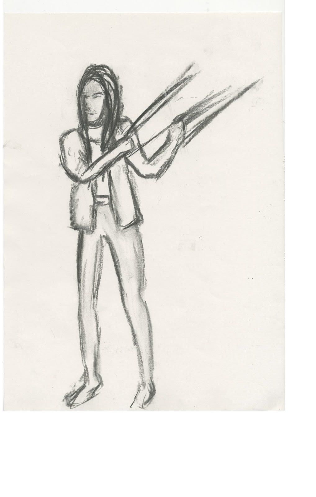
I firstly began to design my young girl aged 3 who gets caught inbetween marching rebels.

For my sketches I decided to use the medium of pencil and charcoal. From the initial visual research sketches I did, charcoal stood out as an effective method to pronounce emotion and hardship, making it a good tool to add some depth to my sketches.

These are some of the references I used;


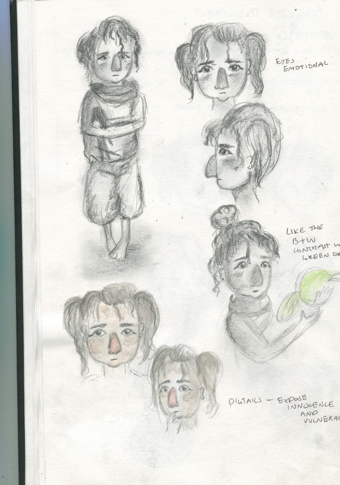
I took inspiration from all children, using they face shapes to get the age, their eye shape, hair and bits and pieces from all their clothing and combining them;


I decided on a face shape and eye shape, then I decided on pigtails as they show vulnerability and innocence, contrasting to the rebels striding past her making the scene way more dramatic, they also show her age more. The pigtails are very messy to show her distressed state, exposing how in need of help she is, the help from Oxfam. I decided on some distressed bagging clothing to also show this disposition.


For my 7 year old boy I used these images of reference; 


Yet again I took bits and pieces off all children. The last boys baggy jumper with T-shirt underneath I used to expose his malnourishment (from drinking dirty water). I also used the 6th boys hair style, but more messed up. You can see my development of the faceshapes and hair;


47 Year old mother references;


It was quite hard to create a 47 year olds face shape without it looking too old, getting the creases right etc. But I was happy with my final face design in reflecting her age effectively.


Next was her 2 year old child;


I was happy with the chubby style face shape and in how it shows her age and the messy curly hair.

But I was very inspired by a child I saw wearing a coat. With her hood up it looks like it has been put up to protect her from the smoke from the bombs. With her curly messy fringe peeping out of the hood I think it is a nice outfit and adds to the drama of the scene.


For my 9 year old boy I decided on a more elongated face shape to show this maturity in contrast to my 7 year old boy. This character designing process for my 9 year old boy wasn't as elaborate as the rest because of timing issues I feel he won't have a change to be on the screen for long and he will be in the dark most the time, trapped in the rubble.