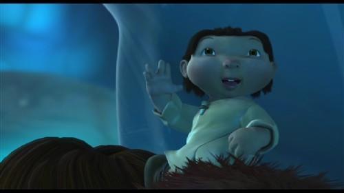
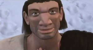
I love the Character Design for Ice Age, especially that of the character Roshan. I find it brilliant how they made a character look so cute yet maintain the neanderthal, inuit style appearance. With the unusually elongated rectangular shaped head, eyes far apart and chubby cheeks with the black dread-like hair. These facial properties make him differ from other cute child characters which usually consist of huge exaggerated eyes and tiny mouths and round chubby faces;
I think his mannerisms play a massive part in how we perceive him as vulnerable and cute however;
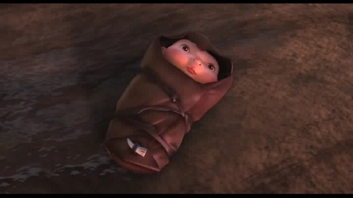
And there is nothing more adorable when you see him wrapped up in the brown shoal with only his little face exposed.
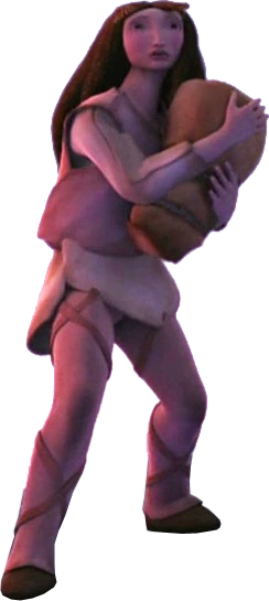
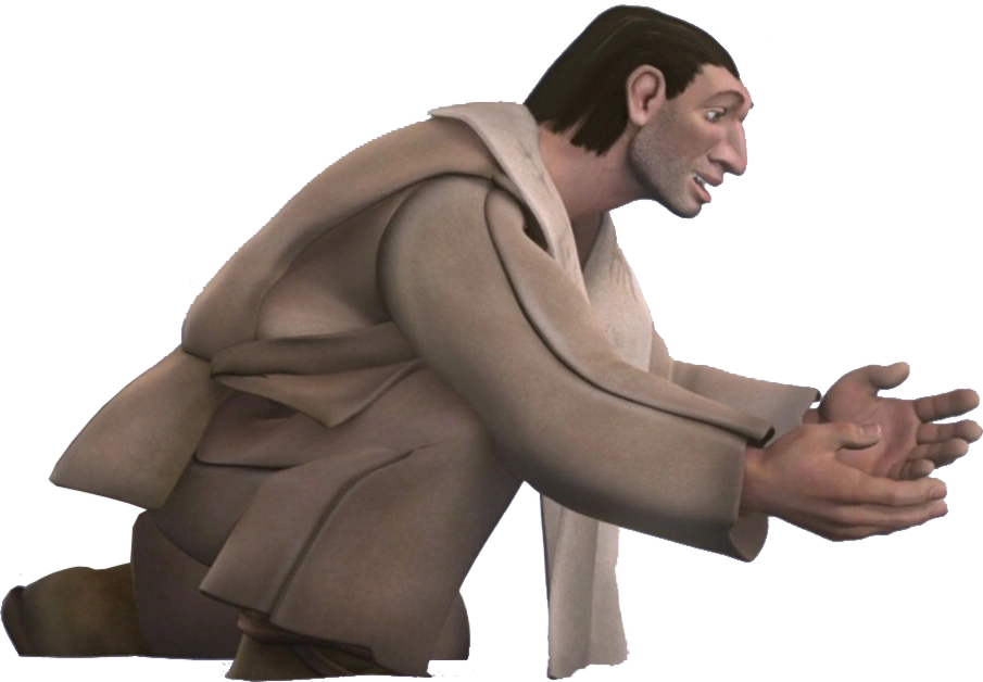
I also love the incorporation of neanderthal on the characters of Roshans mum and dad (Nadia and Runar)
The distanced eyes and, widened heads long noses with large bridges and larger hands are all neanderthal elements and go towards making the humans seem very primitive and therefore on a par with the animals, which are the basis of the whole story.
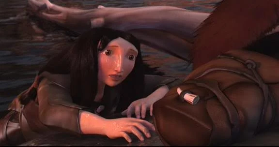
It is clever how they have made the humans and animals coexist in style. With Sid having far apart eyes too and many of the animals having small eyes in comparison to their large face shape, matching the style of the humans. This is reflective of that time period, when humans were on the same level as animals, we coexisted, unlike today.
Today I was enlightened by watching for the first time the 2009 animation, Up. Such an emotionally captivating animation, but also what I loved was the Ronnie Barker-esque character design of Carl.
When looking at character design sheets I came across this concept image by Pete Doctor who worked on the character design of Carl.
It really brings to the surface the contrast of the balloons and the persona Carl takes on after the passing of his wife. The bright colours of happiness the balloons connote of and the green, stingy aura of Carl as a contrast. They also connote of the times he had with his wife before she passed, which is an emotional concept.
Im glad they never kept this concept fully though. Because Carl should be a liked protagonist, if he was as awful as that drawing suggests, he would not of got such an audience's following which would of made the animation not as heart-warming as it turned out to be.
It was a tough job to achieve on character design. They had make a "grumpy old man" facade of Carl, yet still maintain the friendly, loving, old romantic inside.
I think what helped achieve this was how we watched him grow on screen, physically and emotionally as we stand along side him as he endures both love and loss.
Even though the deep creases on his features make him seem like a man who is always angry, his eyes have that certain sparkle of the loving man within, a great aspect they have achieved in his character design.
I also love the native box shape of his head that becomes more prominent the older he gets. I feel this box shape could be representative of how he boxes up his feelings, reflective of the reserved person he is.
Browsing the Blogger page Living Lines, I came across some Treasure Planet model sheets, one of my most favourite animations as a child and I just HAVE to talk about how beautiful it is.
What this page highlighted to me, was how extensive character design really is and how much things adapt and change to get the results everyone is 100% with.
It was interesting to see the beginnings of the character Morph;
It surprised me to see in the original concepts, Morph with legs. The legs look incredibly out of place and don't fit with the body at all. But what I did like is the colour of morph, the character is constructed from space matter, it looks magical, like he is made from the galaxy which reflects his ability to morph into any matter than exists.
This was the final rendition of Morph. I feel the space matter with the black eyes looked wonderful but obviously you can see what Disney have wanted to achieve, they wanted Morph to ooze cuteness. Choosing the translucent colour pink makes the character seem quite vulnerable as light pink is a very sensitive colour, along with his enlarged eyes (in comparison to the previous design) makes Morph incredibly cute and an instant likeable character that the audience will bond with instantly, the original designs do not achieve that character persona.
What I also loved about Treasure planet was the character design of baby Jim.
This character design image sums up why I loved it so much. The use of the sketchy circles made the baby jim look round and plump like a typical baby with baby fat. The animation of him is wonderful, the way he rolls on the bed and how his mum blows a raspberry on his tubby belly is adorable, he has a plump texture, you just want to give him a big cuddle and squeeze.
After Manchester Animation Festival, I was greatly inspired by the Tom Moore masterclass and the character design in Song of the Sea.
I love especially how the characters just ooze fantasy, with mystical and spiritual elements complementing the theme of the film itself, all built upon the ketlic myths and legends of the selkie.
One character that is a great example of this is Macha, who's character design is strong influenced by an owl. This is present with her eyebrows, beak-like lips and her eyes themselves. Tied along with her "swooping" sleeves and fetaher-like cape really creates this strong visual aesthetic of an owl.
The owl is a symbol of mystery, wisdom, secrets, intelligence and mysticism, which is really appropriate to the character Macha and her persona.
The character design is so organic, which is what Tom Moore wanted to achieve, this hands-on feel which fits with the traditional and mystical aura of the animation.
I find it brilliant how the character "Ben" was based on Tom Moore's own son, he even used photo references.
This adds another level to the animation and makes it very personal attachment to Moore himself, which is special. Because the amount of work that is put into an animation, you end up getting a personal bond with it anyway and to base a character off of someone so personal to you intensifies that bond.
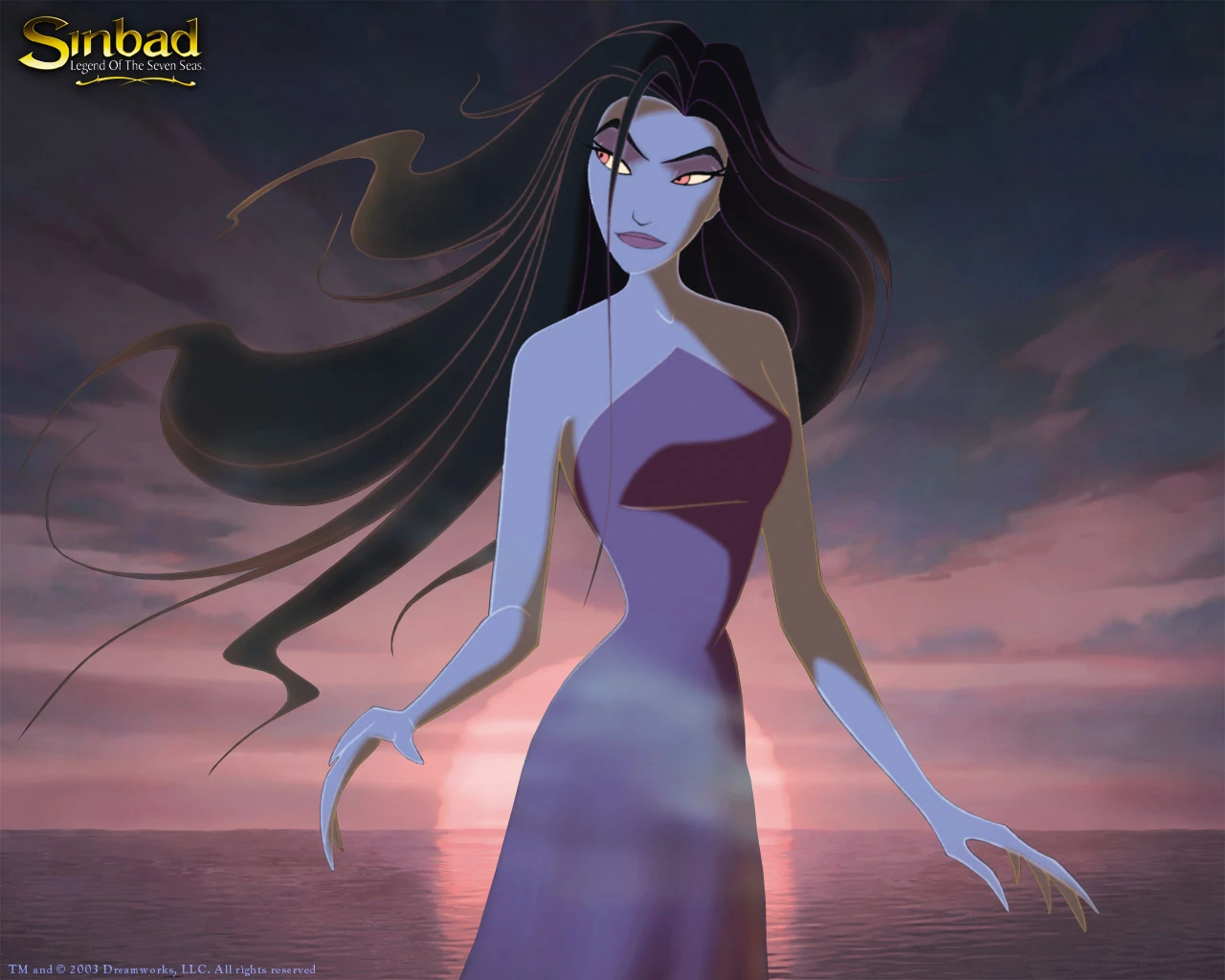
As a child, I loved Dreamworks' own adaptation of the story of Sinbad. When I found the character design concepts on Living Lines' Blogger page I was instantly enthralled, especially by the concepts of the Goddess of Discord, Eris.
Carter Goodrich created an early initial concept for Eris which portrayed her of being, fearsome and extremely dark. Her long dark dress, unflattering, aids this dark aspect. She is unsexualised, making her undesirable and therefore a very fearsome being to contend with.
Seth Engstrom however contradicts Goodrich in introducing a sexual element to Eris, which was later decided to be more effective. This concept art reflects her as being an enchantress, the seductive yet also very evil smile, the lacking of clothes and her robes casting out of her like organic tentacles, showing her ability to exercise control and manipulate what ever she wants, the darkness of the robes connotes that this manipulation is of evil intention, which with the title "goddess of discord" we know to be true.
As you can see in the final artwork, the sexual element to Eris is profound, taken from Engstroms initial art. Her waist is considerably small whilst her breasts remain above average cup size, with dark heavy hair, she comes across as a seductress, especially with the piercing eyes. Her fingers are longer than average and claw-like, yet again exposing this evil element but her longer fingers could represent her ability to take hold of a situation strongly and manipulate it to her own evil accord. Considering the movement of Eris, Engstrom's organic concepts are echoed again as she moves in a ghost-like fashion;
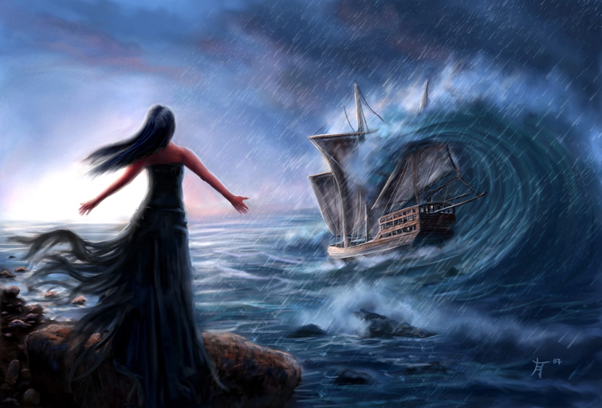
Some body parts distort with her movement in a swiping fashion, which is very organic. This exposes the fact she isn't part of this earth, she is otherworldly, beyond otherworldly because she is a goddess, she controls the worlds. But also I feel this gives her a siren like quality;
In Greek mythology Sirens; "were dangerous yet beautiful creatures, who lured nearby sailors with their enchanting music and voices to shipwreck on the rocky coast of their island." It is highly likely that her appearance was modelled on this myth of the Sirens, considering the story of Sinbad orientates around the sea and its natural, organic elements, even if she is a "goddess of discord" not a goddess of the sea. Sirens usually have this organic appearance/movement because of their relationship with the sea too.
If we compare Goodrich's initial art to the artwork of the Siren, we seen a profound similarity, especially with the organic nature.
Her hair takes on the flowing element that Engstrom also introduced, which enhances her darkness whilst also adding to her sexualisation as flowing, loose hair has connotations of being 'wild' and overtly more sexual.
Once I was happy with the adjustments in the actual animation I now wanted to test some adjustments in premiere that would act like a filter that would change the overall environment and aesthetic of my animation..
I first tested with colour saturations, editting the luminance and chrominance, seen as the only colour of my animation resides in the background, only the background changed and I was able to create quite cool cosmos effects;
I then played with the colour correction;
Giving me the ability to change the colours of my shadows, midtones and highlights.
I could create quite galactic looking effects;
I then tested some lighting effects.
I chose the direction of my light source to give my animation that extra lighting sheen and depth.
After playing around I became very interested in the 3- way colour corrector tool.
I created quite a blue midtone which created this cold environment.
When put with a yellow highlight a sepia , old fashioned tone started to emerge.
Then finally I ended up with this effect, It has a mouldy sheen to it enhancing the mouldy aspect of my animation with the alien. I also love the yellow and blue , a contrast in cold and warm tones that go together. The vintagy look could also be reflective of the first moon landing... an an answer as to why NASA never went back on the moon..
To enhance the mouldy aspect of the rock that he picks up and inspects, I added a little dust effect after he pats and rubs the rock which I find quite effective.
I then wanted to test the effectiveness of adding a mouldy aura to the alien.
A mouldy aura that I made move and "come alive" as such, to highlight the presence of the rife bacteria around the rock;
This is my final render with this mouldy aura and I am not 100% happy with it, I think the mouldy aura is a bit too over the top and doesn't fit with the rest of the animations aesthetic. Also bacteria wouldn't move like that on the moon (even though I am not staying too true to the physics) I think its too much detail to fit into such a short scene time, it needs longer and I can't cut down my film any further without things not making sense. So I have decided to get rid of that.
When we look at the history of animation used within advertisment, you could say it dates back to 1899 with 'Matches an appeal' by Arthur Melbourne Cooper. 'Matches an appeal' could be classed as a stop-motion advert, advertising for donations to send matches to troops. The advert consists of a matchstick man, using matchsticks to spell out the companies name. This was a turning point. Suddenly people were starting to realise that animation can have as much impact as illustration in campaigns. A great example of illustration proving most popular in an advertising campaign is Norman Rockwell's illustration for Coca Cola;
Who painted their ads between 1925 and 1939. They are now considered as pieces of art that would sell for $500,000 in auction. It is safe to say he helped the brand massively in becoming the iconic product it is today.
Nowadays in comparison we mainly use 3D software to create animations. Why is this? Because it is more industry efficient, there is a lesser waste of materials seen as it is all CG which makes it cheaper and it is also more efficient and quicker, which is what is needed for the mass consumerism society today.
However, only recently I was pleasantly surprised by a new advertisement by 'carwow' which I found very creative and a tribute to the old processes of animation;
The advertisment is really creative in how it employs a phankinascope on the car wheels, so as the car wheels spin, the cut outs come alive, all signifying points about what the brand has to offer. I feel the advert is very effective, the complex phankinascope creation conveys the professionality of the brand. At the start we see who we assume to be the animators carefully crafting the phankinascopes, conveying the brands originality in using such an outdated form of animation and their creative flair in comparison to other car brands out their. The animation intrigues the audience with its aesthetic, therefore effectively persuading in the process.
In the Golden age which lasted from 1923 all the way through to the 1960's, America made it's firm place in the world of animation, with the likes of Walt Disney pioneering. Disneys "Flower and Trees" was the first animation to use the 3 strip technicolour;
Which became one of its trademark symbols for the studio.
Snow White was also the first ever cell animation.
Disney's 'Nine Old Men' revolutionised the industry in the 1930's with the introduction of the 12 principles of animation, which they later published in 'The Illusion of Life' (1981)
Before these, animations were crude in style, mechanical stiff and rigid with lots of symmetry, which made their appearance very flat. The body parts looked all merged together too, rather than being connected at anchor points. This obviously changed with Disney's introduction of these 12 principles.
Fred Moore also began to edit Mickey Mouse's physical appearance, to become more pear-like and organic, this allowed for a 3-Dimensional look and a more pliable aesthetic of the character. This is something that we see all too frequently now in character design, characters being made from these native shapes as it gives us the ability to re-draw the same character over and over again efficiently.
In the 1950's - 60's we began to see TV's becoming more affordable for the masses, thus becoming an alternative to going to the theatre of cinema meaning the animation industry took a big hit. Also in the 1950's we saw a decline in the amount of companies deciding to animate because of the production costs and changing tastes. Animators were forced to cut more and more corners of their work and constantly adjust to new styles.
It was this that lead to sourcing for more economic ways of animating, and with a rise in computer technology and software, animators turned to computers which lead to the birth of CGI and 3D animation.
What we also saw in The Golden Age, was animation being used to achieve a more political purpose. In 1945 Mitsuyo Seo created Japans first animated feature film, 'Momotaro's divine sea warriors'. It was commissioned from the Japenese Naval Ministry as a form of propaganda to support the war.
Later in 2004, Studio Ghibli created 'Grave of the firelies', however this was not a form of propaganda, it instead conveyed the political message of the hardships the Japanese endured during the war, leading to their eventual surrender.
Previous to 'Grave of the fireflies' In the western world Peter Folds created the animation 'A short vision' (1956) which also conveys a deep political message, warning of the horrors of warfare, specifically nuclear warfare and its power to kill all life.
From McCay firstly introducing animation into live action, animation began to become incorporated into live action more frequently but for different reasons than McCay..
We saw animation firstly become a tool to enhance the visual effects of live action.
Georges Méliès was a professional magician, whom by accident discovered that he could use stop-motion to render trick visual effects, thus incorporating his skills as an illusionist to film. He also was the first to use the fade-in, fade-out and dissolve technique to create the first real narrative films. Méliès was a revolutionary figure in showing that film can be what you make it with the use of animation, whether its to create illusion to stun (like Méliès) or wonder to entertain.
Ray Harryhausen was another pioneer in coexisting these 2 mediums of film to create masterpiece in Jason and the Argonauts. (1963) Harryhausen made monsters real. Using puppets and green screening them onto live film footage, he made them interact with actors as if they were real, children did believe they were.
For many people this was the first time they had witnessed animation being used in this way. When put alongside live action, we believe that the animation is live action of real monsters, and for children who were watching it especially, they went away thinking monsters were infact real. This is a fine example of how with animation anything is possible, you can make monsters from the depths of your imagination come alive on screen for all to see, making the insides of your mind come alive.
This artful combination is still present today. With the likes of the animation studio encyclopedia pictura in the new IKEA advert;
Where live action puppets are conjured into this fantastical animated environment, reflective of the inside of childrens minds at playtime, the characters echoing aesthetically straight from 'Dark Crystal' (1982). In my opinion this commercial is highly effective, the imaginative features reflect onto ikea itself, branding itself and therefore its products as unique and innovative, capable of making childrens minds come alive with their products. The colours are bright and bold, connoting of fun and happiness, along with the slogan "come home to play", depicts how they can supply your home with all the elements needed for a good, enjoyable childrens play time.
The Dark Crystal (1982) for comparison;
Because of the film industry wanting more realistic special effects, stop motion began to fade. Stop motion offered a crisp, still photo in each frame, which is unrealistic of real movement to the naked eye as we get "Motion Blur" and so "Go Motion" was created which creates this realistic blur and was first employed in Star Wars - V.
Later leading on to the CGI graphics of today, with the rise of computer technology, also becoming a more economical alternative to puppets and paper.
In the Silent Era, (1899 - 1924) Walter Ruttman was a pioneer in experimental film. When we look at his background, we soon start to see beyond the abstract colours and shapes. Ruttman served his country's military in WW1, as a result he lived on with severe psychological trauma. Thus from this we can depict that this experimental animation could reflect the psychological trauma in his mind, the confusion, the bad thoughts, etc, which adds another depth to his animations which is truly amazing.
Ruttman created his (avant-garde at the time) animation with paint on glass, where each painted shape was photographed before being wiped from the glass and repainted to form the next frame. Ruttman also explored a relationship between sound and shape, which was different in that time of film. I feel Norman Mclaren took great inspiration from Ruttman, in his 1940 video "Dots" which is very experimental, in both sight and sound as he explores the relationship between visual imagery and sound, creating shapes that are reflective of the sound that he makes by scratching onto the film, rather like Ruttman who creates shapes reflective of the sound you hear in Lichtspiel Opus I.
Lotte Reiniger was the pioneer of silhouette animation.
she created beautiful silhouette animations from black paper cut outs, that were fantastical and mystical. This from of animation recently made a comeback, but in the new medium of CG. Here when we observe the graphics of the game Limbo (2010), which probably wouldn't exist if it wasn't for Lotte Reiniger pioneering the use of silhouettes in animation.
Also in 2010 was the release of "Invention of love" by Andrey Shushkov, employing these silhouette lighting effects, to create an austere mood and atmosphere, to represent the bleak mechanical world, and create the feeling of steam and smog from the machinery using slightly frosted layers. She creates an industrial world, where our love for the environment has gone. The main message Shushkov employs is one of how our love for machines and industry is overpowering our love for our own environment, which is more important.
Emile Cohl was also a breakthrough in the silent era, it can be considered that he was the first animator to explore the relationship between character and narrative within animation, instead of just creating animation for just the aesthetic of making things move, she actually creates a story to engage the audience.
It is rumoured that Ladislas Starevich was inspired by Emile Cohl in manipulating objects and bringing them to life. This is present within his animations as he manipulates the corpses of cockroaches to give the illusion they are alive with anthropomorphic qualities and
stop-motion techniques.
I feel Starevich inspired many animators with his dark, stop-motion style. One of which I feel is Paul Berry, with his famous animation; The Sandman (1992) which has this creaky movement which complements the dark aesthetic of the animation. Tim Burton and Laika Animations also, taking on this dark aesthetic of childrens animation with a quirky, creaky stop motion movement.
You can also depict that Windsor Mccay was aslo influenced by Emile Cohl's 'Fantasmagorie' (1908) motifs to Cohl can be found within 'Little Nemo', with the use of dots forming into nemo echoing the repetitive use of dots in 'Fantasmagorie'.
McCay also was the first animator to coexist animation and live action within 'Gertie the Dinosaur' (1914), in return this made animation appear as realistic as live action when intertwined, increasing the "magical" aspect it obtained through it's early years from the pre-film mediums.
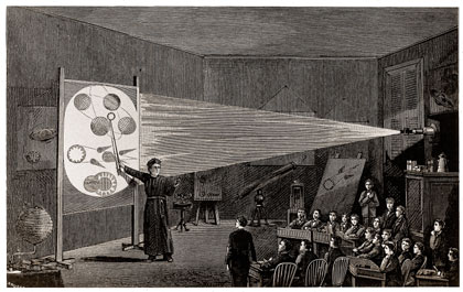
First on the timeline of film and animation was The Magic Lantern released in 1650, the fore-runner for the modern slide projector.
It used a light source (which was either a candle or an oil lamp) to project a translucent image through a lens onto a flat surface, including a wall meaning it can be projected to entertain masses. It is simple for us, but was quite a big technological step forward in 1650.
It's main purpose was to entertain and mystify audiences of it's time, which it certainly achieved, it's audience had seen nothing like it, it was magical and revolutionary. It opened the doors to a new form of entertainment that wasn't going to the theatre, playing ball games, or painting. A form of moving image that would revolutionise theatre and art.
There were no further developments till the 19th Century with the Thaumatrope by Sir John Herschel.
This played with our persistence of vision, by placing two different images on the different sides of the same piece of card and spinning it rapidly with a piece of string through the middle, it creates the illusion that they are infact on the same piece of card. Therefore meaning you can create the illusion of something being inside something else for example a bird in a cage. This became a toy and form of entertainment for children and adults, who enjoyed being mystified by such optical illusion.
Closely following in 1831 was the Phenakistoscope, created by Joseph Plateau and Simon von Stampher. Which could be considered as the first attempt at animation, bringing drawings to life. playing with the persistence of vision aspect similarly to the Thaumatrope, to create the illusion of motion.
The viewer observes the animation in a
mirror by looking through the slots as the disc spins.
Film making duo the Brothers Lynch created a music video for the Carly Paradis song "The Hope of a Favourable Outcome", using GIFs of original Phenakistoscope's from the victorian era. It is mesmerizing whilst also remaining grotesque in their 19th Century aesthetic. The relentless beat of the song along with the seemingly endless tunnel of Phenakistoscope's, almost sends you into a trance.
I find it overall quite disturbing, the spiral effect along with the grotesque illustrations. I also find it weird how we consider illustrations from that time period so awful to look at, like they were born reflective of the dark and dingy streets of victorian Britain.
3 years later the Zoetrope was invented by William Horner, similar to a Phenakistoscope but with a cylinder instead of a disc, with vertical slots inside. They are printed on cards and placed inside and viewed through slots when rotated. In the 19th Century, Zoetropes were yet again used as a form of entertainment, to give the illusion of life to drawings. Nowadays, Zoetropes are not as such a strong form of entertainment, now we have more wider mediums of entertainment. Now we use it to intrigue and to be unique, using techniques from the past. Also to pay tribute to such mediums that paved the path to the animation mediums we have today. An example of this is seen within Comodos christmas Zoetropes for TVE;
Here Comodo pays tribute, yet also uses an appropriate medium to reflect the traditional aspect of christmas, to zoetropes. The hand-made, hand-crafted feel is really reflective of the christmas spirit, with cards and craft-markets which are rife throughout the festive season. Zoetropes as a medium of animation, have a very magical aura about them, deriving from how our victorian ancestors viewed them as they had no other forms of creating the illusion of life from moving image.
A more modern day concept of zoetropes is present within these 3D printed ones;
This is a great example of combining modern day processes and traditional methods to create something truly beautiful and unique. The fact it is a Zoetrope adds gravitas too and makes it 10x more amazing than if it was just created on some 3D software program.
In 1868 we saw the birth of flipbooks, one of the first examples of sequential imagery. A book with a set of images printed on one side that when flipped creates the illusion of motion, working on the same principle as the Zoetrope and Phenakistoscope but with layering up paper in sequence and flipping to see the image come to life. A medium which also hasn't yet died out. As we observe these beautiful Japanese Flip-books by Mou Hitotsu no Kenkyujo;
Mou Hitotsu no Kenkyujo has transformed our old ideology of flipbooks, they aren't just a traditional medium of animation anymore, they are a magical medium of storytelling that you can unleash with your thumb, and takes you on a visual journey.
It is also brilliant to see Disney pay tribute to such a traditional method;
After becoming a worldwide successful animation company, to still pay tribute to the mediums that got them to where they are today is brilliant.