Thursday 29 October 2015

Apply - Storyboards and Character design.

For my next brief we have to create 10 seconds of animation from a medium of our choice (That we have experimented with) and it has to reflect one of subjects; Fear, Hate, Love, Happiness, Surprise and Longing.

I have chosen longing. I experimented with a few ideas but have decided I with one idea of a plant creature who longs for beauty. He finds a flower in a forest floor, and longs to own its beauty. So pulls it out and attaches it to his twig head. However the forest isn't happy with his decision and begins to close in on him. The End. Considering this is 10 seconds, quite a bit of cropping may occur, but I like how beautiful this little short is.

Initial Character Design


I started off with a fluid, organic looking character with a ghost-like sapling body.


This then developed into a creepy vine like character, which I decided was going to be far too complicated for 10 seconds of animation. So discarding the arms and legs I created a little bulb like character who bounces and has a twig on his head.

These are some of the images that inspired my final character's design:
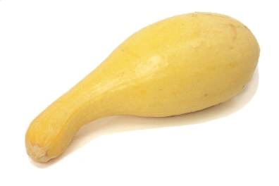
Plant bulbs:


The roundedness and the spiny, spindly twiggy details.

And some vegetables:


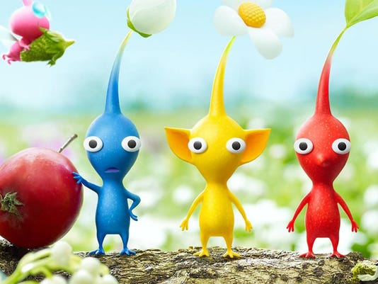
It also caught my attention that my character slightly resembles Nintendo Pikmin;


This is the example of my short storyboard:


Seen as there isn't much shot variation as it's  5-10 seconds of footage, I have included time scales in seconds to help out the creation process. My storyboard is short but detailed in how the movements will play out. 

I have decided to go traditional and hand-draw my animation seen as this is a new thing to me and would love to play around with this medium more. I will later scan in my sheets and if I have time, create a background and setting.

To familiarise myself with drawing the character which I have named "butternut" (as I will be hand-drawing each frame) I decided to do another character sheet. I also planned what aesthetic the flower will take, seen as it will have magical qualities, which is what attracts Butternut to it, I decided on an elegant looking flower, with sharp edges suiting the aesthetic of the animation. But also I included as if this flower did exist in the wild, with it being so sought-after, it would have a defence technique for insects.


I then tested colour renders digitally on Photoshop (seen as my animation would end up being rendered there).

Digital Butternut render


Seen as I preferred a dark background aesthetic, I tested my renders against a greyscale background, to see what colours coexisted with this environment best, all the tones are quite dark for this reason, but I explored a wide variety of the colour wheel. I decided that the orange body stood out to me the most, it contrasts with the grey, but in an effective way, I don't want him to fully coexist with his background in order to personify my message, but I want him to suit it and orange is successful with this.

Butternut's magical flower render


I wanted the flower to coexist more with Butternut than the environment, so I drew the flowers on Butternut's decided colour of orange. The colour that appeals the most out of this selection is the purple in the middle. Orange and purple are almost opposites on the colour wheel, but when put together they suit really well. Orange and purple also connote of halloween and horror, suiting the dark aesthetic of my animation. 


Monday 26 October 2015

NSPCC - Pete's Story (Winner at D&AD Awards 2015)


NSPCC : Pete's Story from Daniel Bruson on Vimeo.


Stunning and poignant. Is just two words to describe this animation. This animation is hand-painted frame by frame, the paintings are beautiful and sketchy and have a colourless tint to them, apart from the green, this emphasises the green, a symbol for the NSPCC. The green is seen in the laptop and the phone as the boy could seek help with the NSPCC with these. However the green also symbolises the freedom the NSPCC could offer for Pete as it is present within the sky and behind the door.

The opening title sequence starts off with a child writing "Pete's story", this instantly makes it personal to the audience and informs you of the journey you are about to go on. Bruson employs beautiful transitions from scene to scene it offers a sense of fluidity like you are going on the journey with Pete.

Bruson moulds the paint in a beautiful way, showing intense lighting and shadows. The light pans through the house casting long shadows, which is most symbolic. A child's bike casts a shadow, representing how a child should be out having fun, not being abused. The shadows themselves are heavily metaphorical of the abusive, dark situation. Like Pete's life is in a shadow.

I love the starting scene where Pete is playing like a child, all happy then suddenly his violent mum approaches through the door and the atmosphere instantly changes as she slams the door where the outside turns green, symbolising the NSPCC helpline and freedom from the abuse however, contrastingly the green also sets an ominous atmosphere and instantly changes the animations demeanour for the darker.

In terms of advertising, I think the animation grabs your attention, you instantly realise the situation of Pete, you pick up on the repetition of the green a common symbol for the NSPCC and you recognise the adverts identity quick. (well I did anyway...) So I think that the advert is most effective.

Sunday 25 October 2015

Hand-drawn pose to pose animation - Pendulum


This has been my first ever time crafting my own piece of hand-drawn animation and I have really enjoyed it. Its felt more rewarding than using a computer too. I am happy with the movements of the pendulum, however to have a more ease in and out movement, it might of looked more effective to have the middle frame standing alone so it looked like a much faster action.


You Are What You Eat - My finished pixilation and reflection


My pixilation is finally finished, I have named it "You are what you eat", a common catchphrase that I have taken and used it in a comedic literal sense as in my video, the person literally becomes consumed by the food itself.

I am happy with my pixilation, I went through quite a few stages of hating it and thinking it looks rubbish but the end result has surpassed my expectations! With the addition of SFX it has come into its element and looks rather effective. I love how flickery it is, if it was all smooth and realistic then It would definitely not look as good, it is quirky. The flickery effect almost makes it look old fashioned and intensifies the humour dramatically, the audience are instantly aware it isn't a serious piece of live action, the SFX show this too.

Beneath all the humour I feel I also demonstrate a serious image. In the process of making this animation I had to waste a lot of food, and I hate wasting food so this whole process was disgusting to me. I was making the message of how I have the capabilities to waste all this food, whilst people in lesser economically developed countries die of starvation. I wanted to make a statement how we waste so much food as a nation, by wasting all this food for the sake of an animation.


Just a small example of the food that got wasted.

My pixilation can be enjoyed by all audiences, I have already shown it to a wide variety of people from 6 years old to 50 years old and everyone has been most amused by it, which is exactly what I wanted to achieve! I also got comments like "Oh my gosh all that food, what did you do with it afterwards?" which is also an example of also my serious message being projected, a lot found it striking. But then again, this is what the majority of our bins look like at home. 

If I had more time I would of took more time and care into my photographing, differentiated between shots more affectively and made sure I was happy with each photo I took and that they were all in focus and everything, instead of being slightly rushed with time. What I find most effective is the SFX, they really bring it to life and intensify the humour because of how exaggerated they are, which is brilliant. I also love some of the movements I have achieved, like how I bring the banana to life, and make it crawl across the table towards the prey. I also would of completely covered the person in food, which would of been most shocking to see!

What stands out the most is how humorous it is. What also is humorous is the whole ideology behind it, how as humans we are the prime predator, suddenly when that role is reversed and our own inanimate food is starting to consume is, it is highly comical. 

In the production I used Photoshop video, Quicktime 7 Pro and Premiere Pro to render and stitch together my film.


SFX Credits:
About: Blop or pop high pitch sound. maybe a bottle opening or suction cup. created by mark diangelo.
Uploaded: 03.27.13 | License: Attribution 3.0 | Recorded by Mark DiAngelo 

Title: Rustle
About: Sound of close or similar rustling.
Uploaded: 08.24.09 | License: Attribution 3.0 | Recorded by Caroline Ford

Title: Slide Closed
About: Slide closed sound effect. great for drawer or other such sliding apparatus. 
Uploaded: 01.04.10 | License: Attribution 3.0 | Recorded by Mike Koenig 

Title: Gum Bubble Pop
About: All voicing for this common bubble gum trick. big thanks to sound explorer for another great sound.
Uploaded: 02.23.12 | License: Attribution 3.0 | Recorded by Sound Explorer

Title: Crackle
About: A nice crackle or crackling sound effect.
Uploaded: 09.01.09 | License: Attribution 3.0 | Recorded by Caroline Ford

Title: Hammering
About: Sound of a worker or carpenter hammering a nail into a plank of wood. the thump of the hammer can be heard reverberating through the 2x4.
Uploaded: 06.27.12 | License: Public Domain | Recorded by J Blow

Title: Bite
About: The sound of a monster bite or biting someone. great for those zombie games, or some cool sci fi monster scene. grrrr!
Uploaded: 09.03.09 | License: Attribution 3.0 | Recorded by Mike Koenig

Pixilation Production


After rendering all my photos into scenes I wasn't fully happy with how many of them played out. I felt some scenes ran far too fast, being a perfectionist I the scenes into photo shop where I added extra frames where I needed to to elongate and adjust scenes, correcting minor continuity errors which arose from 5 hours of continuous shooting. This process took a lot longer than I thought it would do.


I then tied together each scene on photoshop and rendered it.


I wasn't happy with the cauliflower ending so I decided to add my own transparent image, it doesn't look 100% realistic, but neither does my animation, its not meant to be realistic, its meant to be quirky and unique, so it fits the style!


I was most excited about adding SFX and I have to say, THIS is what brings the animation to life, they add a whole new depth. They are extremely exaggerated enhancing the humour even further.


I added a credits scene and I creatively made the cabbages spawn over and over absorbing the screen, giving the effect that the food is coming to get the audience. Also for comedic value I used the french alternative to "the end" In the unappealing colour yellow, also to stick with the humour aspect, however it seems to go well with the cabbage.

The Pixilation Process - Photo shooting reflection.


Today I did my photo shoot for my pixilation using my friend as my prey for the food. I had time constraints with this because my model could only stay stationary for s certain amount of time, I didn't want to inflict any hardships onto him, yet it all had to be done in one shoot because of how the food is organised on him and how it can't move. It would be hard to take a break and continue the shot organised the exact same, and I wanted a sense of continuity. So I had to work efficiently, following my storyboard was a key component for this efficiency.

However this time constraint affected the amount of time and effort I could put into making the movements 100%, but I wanted a flickery, imperfect feel anyway, it stimulated the comedic value within it.

I also encountered a few problems, live mode made my camera battery go flat, which meant I had to rent one, this consumed a lot of time up where I could of been continuing, which pushed the process back a lot. I also had to retake a lot of movements, being a perfectionist I wanted to be happy with them, yet also was conscious of time constraints.

Overall, I am happy with how the day has gone but it has been very gruelling and a hard 6 hours work with no break, it has been stressful. But I am happy with my shots, I am crossing my fingers they will look okay when rendered. I think the final shots when he is absorbed in food looks effective, because of the variety of food types and the bold colours, making for an aesthetic shot. If I had more time, I would of spent more effort making him COMPLETELY COVERED and making fluid movements, but for obvious time constraints that wasn't possible, but I was happy with what I managed to achieve.


Pixilation Test

I staged a quick tester, just to see how I can achieve the flickery effect that I want. I moved the cereals bit by bit and tested how it looks when I take one 1 frame instead of twos.


I encountered an issue with the focus because my camera was above the image, gravity kept pulling my lens down out of focus, but I feel it kind of adds to the effect. Almost gives an old-fashioned appeal.


I elaborated on this test and did one with a lot more detail, experimenting between 2 shots and 1 shot for fast movements. The one shot effect here makes the cereals look more alive because of the fast wriggling movements. These tests have been a great insight into how much to move objects to get the effects I want, and how to experiment between 2 frames and 1 to vary in speeds.

My Pixilation Progress Storyboard...

For this pixilation I will need a lot of food, and in the process, a lot of food will be wasted. I find it disgusting how much food we waste as a nation, and how much food we have in comparison to lesser economically developed countries. So I feel with this, I will be making a statement almost, how I have the potential to just go out and buy all this food and waste it, whereas someone in Africa dies of starvation. I will be really highlighting how much of a twisted world we live in.

I firstly planned out my storyboard on post its:


Then I created thumbnails in my sketchbook:

Storyboard 1
Storyboard 2
Storyboard 3

Storyboard 4


Storyboard 5


What I found different with storyboarding a pixilation was the fact that there are no camera pans, as its comprised entirely of still frames. So all I had to consider were a variety of shots. However I wanted the main focus central in order to make such an impact with how the food progresses onto the human, so my shot variety isn't great, but to achieve the certain desired effects I had to sacrifice that.


Thursday 22 October 2015

Edwin Shaap - Little Freak


''Playing with the Audience's emotion is one of the most interesting things'' - Edwin Shaap


Little Freak is a beautiful, brilliant and highly emotional animation short by Edwin Shaap. Done in Maya, this CG animation is beautifully digitally rendered, the greyscale enhancing the emotion in creating such a bleak and austere atmosphere. He has created such intense realism, from the looks down to the perfect face movements. The music appropriately heightens to intensify the little boy's anger, yet again conjuring these emotions inside of you. The remnants of light sparkle on his eyes and tears, his tears slide down his face with a slight white glisten as if they have magical properties, this accentuates them and makes his emotion more evident. The voice fits perfectly, it has a particular nasal quality which suits with the fact he has a large nose.

You feel his pain, his emotion, you want to help him.

Intense lighting effects are used brilliantly, in the trailer the most prominent light source is the candle in his birthday cake, the birthday cake which offers him a wish, the chance for some light to come in his life... for which is says "more wood" and the light is blown out, plunging the setting and everything into darkness, and ending the animation.


I also watched the making of video, which was brilliant to see. Shaap used loads of reference videos which I found most interesting, to get key poses and facial expressions. In order to achieve the realistic face movements he used motion capture on the facial features. It was brilliant to see it come together from initial storyboards, to research and development, to finally 3D sculpting and digitally rendering. I also found it interesting how he used green to intensify the black and white.


Monday 19 October 2015

Home Sweet Home


An emotionally beautiful, award winning Animation short by Pierre Clenet, Alejandro Diaz, Romain Mazevet and Stéphane Paccolat, about a house that goes on a journey from its suburban town.

The setting for the animations looks post-apocalyptic, no human remains in the homes or in the settings, it also looks wildly overgrown. Now the houses have a life without us.


Each scene is beautifully crafted and thought about, each time you pause it, you are fixated on a piece of digitally rendered artwork in itself.


I also love the character development between the houses and the anthropomorphic features of the houses, you ask yourself, how can a house ever be perceived as vaguely human in characteristics?

The blue house sets off on his journey first, with the clever feature of his light turning on to show he is awake, the foundations of the house become his feet, and the sound effects fit perfectly to mimic the sound of his old, creaky exterior. 


Then we are introduced to another house, from his obvious old discolouration and bushy overgrown weeds on his roof resembling facial hair, we see this house as an old man. What I also found a beautiful touch, was how the old house walks with a piece of his balcony as a walking stick, yet again enhancing this anthropomorphic character image of an old man. Together they go on a journey with their pet dog. (A dog kennel... I love the clever and imaginative touches, they give it that extra sparkle).


There is a heavy focus on the weather within this short, emphasising everything our house endures whilst we lie comfy inside, I feel the animation really explores this attachment to our homes. The weather also acts as a pathetic fallacy in the emotional scene when the sun rises, and it becomes evident that the old house has passed on. The rise of a new day, yet the house will never rise from its slumber. Then we have the beautiful dramatic shot of the fiery sun central with the house.


Grave of the Fireflie's


Grave of the Firefly's is (quite an overlooked..) animation by Studio Ghibli, directed by Isao Takahata.

I found this film beautiful in both narrative and aesthetics. Grave of the Firefly's is an animation not aimed at the younger audience, this is quite unusual to see in animation because of it's stereotypical innocent, child-like qualities. The reason for this is because of the harrowing and upsetting scenes the animation tackles as it follows 2 siblings and their heart-wrenching fight for survival in Japan at the height of WW2. With this serious issue, comes the communication of how much destruction Japan suffered during WW2.

The film hooks you emotionally. We bond to the characters, we see them develop, we become a part of their lives. This is all enhanced through brilliant character development, we get to know their personalities and become instantly aware when everything is going wrong... From the start we are shown their ghosts, we already suspect how it is going to end, we are already shown a teaser of how emotional this film is going to be. Their ghost selves are depicted in low lighting with a red light to show the bloodshed and destruction that was unjustly spread.

The symbolism of the fireflies is most profound. The fireflies represent the lost souls, how the innocent civilians that lost their lives in the war were like nothing but mere insects to the opposition. (Pest control) And the glowing light a reflection of the firebombs that terrorised them. At one part of the film, Setsuko even makes a mini grave for the fireflies, a poignant and symbolic scene, how the film gets its name. Setsuko cares for the fireflies and the fireflies even become a source of light for them, a beacon of hope to survive, like the lost souls are guiding them in quite a spiritual way. 

One part that stood out to me the most was the Setsuko montage. Showing her being her, her mannerisms and beautiful personality to sad music, really set my emotions high. Whats the most thought-provoking saddening thing is that this actually happened, children like this died in circumstances like this. We aren't really reminded of that fact with it being an animation as animation distances itself from reality somewhat. 

Grave of the Fireflies is an animation you will not forget in a hurry, it has its heart-wrenching hooks embedded in your mind, so much so, It doesn't need a re-watch because it will stay with you for so long. Beautiful.


Sunday 18 October 2015

Norman McLaren - Neighbours


Norman Mclaren was one of the pioneers of Pixelation. My favourite film from McLaren is "Neighbours", not only is there quite a serious message hidden deep within, but it is most enjoyable to watch and extremely clever from an animators point of view.

The film follows two men which become enchanted in a sort of mystical manner about the sudden appearance of a flower. The flower projects a great amount of power, giving the men a "high" feeling from smelling it and being around it. The contextual information of the short film (released in 1952) tells me that there is an anti-nuclear war message within, the flower is an allegory for nuclear weapons and the power they possess stuns both the men in this haze of desire to own the biggest and best weapon on their craze for world domination. The fact the flower isn't actually a flower but a weed, could reflect the repugnant attitude Mclaren has towards the use of nuclear weapons and war in general, but also the wild, uncontrollable nature of the weapons themselves.

They end up fighting over who who should own the flower, like the fight to have the best weapons. They build a fence between them in another attempt to own the flower, this has connotations of the iron curtain.

The fight turns quite primal in nature, the ripping of clothes and pulling of each other, reflecting how the use of these weapons could revert us all back to this primal, stone-age way of living because there would be nothing left (If we were lucky enough to survive)....

It escalates even further to the point where they go and kill each others innocent civilians, reflecting the use of bombs in other countries leading to the loss of innocent life.

Finally, the fight ends with the death of them both, showing how with Nuclear weapons, no one wins.

You can't ignore Mclaren's sound effects, eerie and creepy in nature, which complements the austere message behind the film. And of course what gives his SFX the extra gravitas is how he makes them himself by drawing directly onto the sound track creating a form of 'visible' or synthetic sound, which is amazing to think about.

I really admire how serious and striking messages can be intertwined into a thought-provoking piece of moving image.

PES Film !


PES's film are satisfying to watch, they are innovative and quirky and have that mystifying element that renders you unable to stop watching.

He uses realistic sound effects to convince the audience that these inanimate objects are food. With them he convinces you into thinking they are edible by relating them to food we all know and love. Your left almost feeling quite hungry, hungry for some string with added rubiks cube and freshly grated glitter, which is humorous to consider, but then again PES's films are largely based off employing that element of humour.

PES is a great example of how pixilation can bring things life, adding that element of believability through the sound effects. If you watch the video muted this same effect isn't achieved, this really highlights the impact SFX can have on film and video, and therefore is something I should consider with my own personal pixelation.

Thursday 15 October 2015

Making of my first EVER flipbooks...


Space Hopper


Ball bouncing


Ball bouncing across


This is the first time I have made any flipbooks and I have found the whole experience really refreshing! Having mainly animated on Photoshop, to bring drawings to life with a pencil and paper was really enjoyable and different for me.


What made flipbooks so interesting, was being mathematically precise on each frame, and playing back over and over to be 100% happy with the movement.

Based on the 12 principles of animation, I made a ball bounce in one place and then bounce across a path, demonstrating easing in and easing out and squashing and stretching.

Then for the last flipbook you got to choose your own mini animation, for which I have created a girl on a Space hopper hopping across the page till her hopper pops and she falls on the floor. To get the motion correct I used a video reference:


Im overall very happy with my flipbooks and the movement that I have demonstrated effectively within. I have picked up some great skills which will help me now when animating hand-drawn in the future. I found the movement of bouncing on the space hopper very difficult to demonstrate realistically, and I had no idea how much It would be, the visual reference was a life saver and I was able to create a fluid movement effectively in the end. I now feel eager to tackle more complicated movements head on, I feel like I have gained quite a lot of confidence in myself as an animator from this study task.


My Storyboard for Incy Wincy Spider

I have completed my storyboard interpretation of the Nursery Rhyme Incy Wincy. Here are an example of the scans:

Storyboard 1

Storyboard 2

Seen as storyboards are meant to be an efficient process I didn't want my storyboard to look so pristine and perfect as in reality in industry, this process should take as little time as possible and I should adjust to that fact right from the start.

I also digitally rendered a few of the frames from my storyboard:


I used the same principles with these renderings, I produced them quickly and efficiently. In these renderings I was inspired by the storyboards of John Neverez, I used motion blur to show the direction of movement clearly without arrows. 


Erick Oh - Heart

Erick Oh is an animator who has worked for Pixar and other world renowned animation companies and has created a unique animated short called 'heart'


Set completely in monochrome, lighting effects cast this world into shadow. This sets a hostile mood over the whole animation which complements the narrative. 

However one object remains in colour and that is the heart which is particularly symbolic, I think the heart is a motif for mankind striving for love and peace in the world, but because of how we are this is not possible, we are destructive beings, it's in our nature. We fight and kill for peace, it's a paradox. 

The animation begins when the heart flops helplessly onto the floor. As the camera pans out we see in the foreground a tree like object. Which we find out later was the remnants of a previous fight for the heart. Then how the short ends is meaningful as the heart flops to the floor once more, for the cycle to keep repeating in an endless cycle, symbolic of how us humans can't coexist peacefully, we are constantly going in and out of war.

The character design is extremely abstract, simple and original. They have plant-like jerky features and movements and are eerie in nature, complementing the whole austere presentation of the animation. Their bodies can morph and shape-shift like they are made from a jelly-like substance, which is almost mesmerising to watch.

The sound effects also fit perfectly, harrowing clicks signify movements from the characters, which is very sinister. The music also heightens the tension, especially at the end and it builds to a climax.

Sunday 11 October 2015

Joanna Quinn - How I Animate

Joanna Quinn has always been a great inspiration for me and watching this video is a great insight into how she works. 


In the video she considers the affect of camera angles and character positions in her storyboarding, to exaggerate the movements of one of her main characters Beryl. Even though Quinn has done the storyboarding process and is beginning to tween the frames together to create one fluid movement, she is still re-considering other positions and re-drawing till she is 100% happy. She even uses a mirror on herself so she can get the perspective angle correct. 

I find it interesting what Joanna states about being an only child, how being on her own meant she spent most her time drawing, fuelling her own imagination, which I can relate to throughout my own childhood of being an only child. 

I also love Quinn's drawing philosophy of being loose and not too precious so you can easily rub out and re-draw movements till you are satisfied, because at this stage you are focussing entirely on movements, not how aesthetic your drawing is, which I find is a great point to consider as quicker is better. When you're happy with the movements, it's only then you should work into them. 

At the earliest stage of the process she is considering sound effects to exaggerate the humour in Beryl's tangled situation. 


Above are some examples of Joanna Quinn's storyboards. You can see her variation of shots and how she tailors the script to it. Her drawings are expressive in movements and are quickly executed. 

Friday 9 October 2015

Persepolis Review

Part directed and written by Marjane Satrapi, the story follows a girl named Marjane who faces the hardships of growing up in the islamic revolution as a woman. As the protagonist, she's not perfect like the countless female protagonists in Disney, she has the flaws which come with being human, which makes her a relatable character and therefore more likeable.


I was gripped by the narrative, you want to follow Marjanes story as she comes of age and chooses her path of not conforming to the islamic regime, which subsequently leads to persecution. You relate to Marjane, you want her to rebel, yet internally cringe as you know the consequences.

The whole narrative is set as a flashback, monochrome in tone, reflective of the dark period in her life. With this comes great lighting techniques to create an austere atmosphere. The use of traditional animation techniques give the animation its own visual style which suits perfectly, it gives the animation an element of fragility unlike the style of CG which is too perfect for what this animation exposes.


The character design is simple, their features aren't overly exaggerated and cartoon in nature which is a great way to approach a serious subject sensitively. It is not intended for the audience of young children and therefore it would be wrong to have Disney styled characters, all perfect and polished. However the islamic conformists were portrayed in a very inhumane manner, all dressed in black attire and their faces looking like a mask, symbolic perhaps for how they wear the mask of the conformists.

A serious, real life event lies deep within, which is quite unusual to see in the format of an animation because of the detachment from reality. Marjane Satrapi informs of the hardships women faced (and still face today) whilst also entertaining. The animation could also class as a form of propaganda, attacking the islamic revolution and how women were treated.

Thursday 8 October 2015

"The Art of the Storyboard"

I have been most enthralled by John Harts "The art of the storyboard", what caught my attention was the storyboard extract from the pre-production of Alfred Hitchcock's "Psycho", one of the most famous scenes in movie history.


The storyboard brought to my attention that you never actually see the knife physically stab the woman. The shots are so cleverly executed, that your eyes fill in the worst part for you, which is the most interesting thing ! To visually communicate something so shocking, without actually showing it explicitly, is brilliant. Along with the music which intensifies the drama and absorbs your attention to the point where you can't take your eyes off. The shower in the shot is used for dramatic effects as it limits our vision as the audience and makes us frustrated as we strive desperately see clearly what is happening.