The tile I decided on from my 24 to develop into 12 more images, was this one. Not for much its artistic merit, but for more the fragmented aspect that I can explore on the figure, using different mediums to represent this fragmentation, also using this to apply different meanings and concepts to the artwork.
I will explore presence and absence, changing colour in the 2 segments (RGB to Greyscale), playing with lines to split up things and show 2 different dimensions, using different mediums in making fragmented characters, the effect from removing the perspective line too, life drawing including this distorted fragment too;
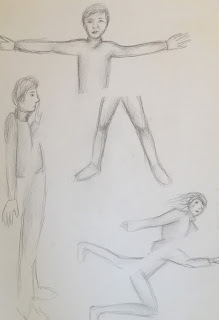
Firstly I explored fragmenting life-drawing. Drawing one half of the body then fragmenting it by drawing the other part out of perspective, askew, etc. I feel the bottom right one looks most effective because it looks like the character is falling as a result from being cut in half.
I created 2 characters which I fragmented. This along with the monotone media I used, applied in a distressed manner, conjours this air of distress around the characters, like the fragmented look is a metaphor for how they are fragmented inside.
I conducted some more life drawing, but this time through some glasses held at a distance, in order to achieve fragmentation and distortion more effectively (than if I wore them). I love the results, I feel I have captured the fragmenting well, considering it was extremly hard to sketch under such disorientation, and the glasses kept moving because my hand struggled to keep them up.
This is a cut out character I created. Where I played with perspectives and fragments yet again. I drew out a big body and a little body, I then cut out the big body and little body in different parts to create this bigger and smaller perspective line. I quite like how quirky this character looks, with ghost joints you can imagine him moving really unique.
This is a watercolour sketch of a young girl character fragmented in the middle. I find this fragmented look much better than the characters I have created with the line still visible. When the perspective line isnt visible it creates this ghostly sort of feel, it confuses your eyes as well, because your head is so accustomed to seeing figures in full.
Because I liked the invisible perspective line I tried it again. This time enlarging the top half and doing the bottom half from a different medium. I feel this doesn't look as effective as with both of the same medium because it confuses you even further.
The thin fineliner and thick pen contrast I find really effective in this response. Not only are the characters fragmented in the middle but both fragments are of different perspective scales and thickness, which is quite effective as a stand alone piece of art work. To me it reminds me of dead body outlines on the floor that they put down after murders. Like these are outlines of people that have just gone, or are still fading, fragmenting as they disappear.
Here I tested fragmenting with the body in different positions. I drew the subject, drew the perspective line, then asked the model to move 90 degrees. You can sense movement in this picture, the perspective line not only divides when the subject turns but it also acts as a motion blur for the hips turning.
This biro sketch is very expressive. Capturing someone mid-scream is very emotional. I fragmented the face with a diagonal divide as if the subject has screamed so loud and cracked the canvas.
This is heavily influenced by Hernan Marnin. I played with the perspective line creating the feeling of presence and absence. The darker the charcoal, the more present the subject, the lighter the more absent and faded. I feel this sort of feeling conveys loss of memory as well as loss of sight. As if the perspective line is moving up, making the person more and more faded.
Paper on card contrast split. Playing with contrasts like black on white, really exposes the fragmenting.
Here I played with splitting the face to divide emotions. Not only have I portrayed the emotions effectively but I even did each side in different media to portray these emotions more dramatically. One in monochrome ink and the other in colourful watercolour. The monochrome having connotations of sadness, the colour showing happiness.


No comments:
Post a Comment