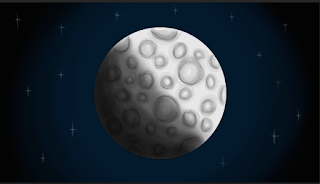
I started off with a cartoonish style.
I disliked how the craters looked on the edges of the moon, the moon looks 2D and silly, and the outline of the craters also didn't fully suit. It is not distinguishable as the moon.
So I deleted the block outline and did a squiggly outline instead, keeping in with the rough kind of style my characters are.
Using 20% opacity brush on black, I sculpted round the edges of the crater to darken them and also rubbed out the centre of them to add this tone.
I tested a darker rougher outline and felt it didn't look necessary. I also added a shadow to show the "Dark Side" and I blended the shadow with the blend tool.
I removed the outline and added some stars.
I darkened the shadow more and felt it really made the moon look 3D and easily distinguishable. But then realised the background needed adjusting to this.
I coloured it in solid black and made a navy blue atmospheric glow around it.
I added more stars for the realism aspect.
Dark increase on the left.
I then darkened the left side to suit with the shadow and lightened the right for the light. Then finally I was happy with how my moon looks. It is cartoonish with a realistic tint. The moon fits with the aesthetic of the animation and I love the idea of having a realistic nebula background and cartoon characters.


No comments:
Post a Comment