Wednesday, 4 November 2015
The Pride of Strathmoor
The Pride of Strathmoor is a dark animated short, showing visually extracts from the journal of pastor John Deitman (1927). The animation covers the dark subject of racism and it's horrifying consequences, which was the norm in 1920's America.
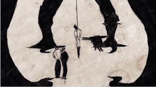
I feel this dark subject is reflected beautifully in Baldvin's choice of media. The use of ink and biro creates a very sinister and threatening feel, because of its bold striking expressiveness. The black, also having connotations of the racism, and the dark, disgusting things that happening in those times. I also feel the black ink adds an old fashioned feel, contextualising the animation in the 1920's time period, further reinforcing this outdated feel is the paper stained background in some scenes and the jittery, un-fluid style of animation. Altogether creating this imperfect, primitive animation, connoting of the primal ideology in the 1920's towards race. Overall I LOVE the medium Baldvin has used, it has made me love hand-drawn as a style of animation, simple and impacting.
The whole animation has a very chilling aura, the eerie sound effects and being narrated with a husky whisper, makes your hair stand on end. Even the character design is grotesquely dark, in-particularly for the black men, who are coloured in totally in black ink and look inhumane in nature, reflecting how society perceived them in 1920's America. All adding to this atmosphere which goes so well with its inner message.
The short shocks, captivates, sickens and effectively tells the diary of the pastor, whilst also highlighting dark messages within, informing the audience of the harsh reality of our disgusting history.
My favourite stills, that show how beautifully dark it is:
Subscribe to:
Post Comments (Atom)


No comments:
Post a Comment